Random Notes - 2/18/23
Some Photo Stuff, Is Nick Cave Evil? Some other random stuff
Rules of Composition
I came across this photo from my Mechanized Carnival project the other day and was immediately struck by its failure to follow any rule of composition. It’s not an obsession, but I’m always on the lookout for a good photo that doesn’t follow any rules. They are harder to find than you might think.
See what I mean?
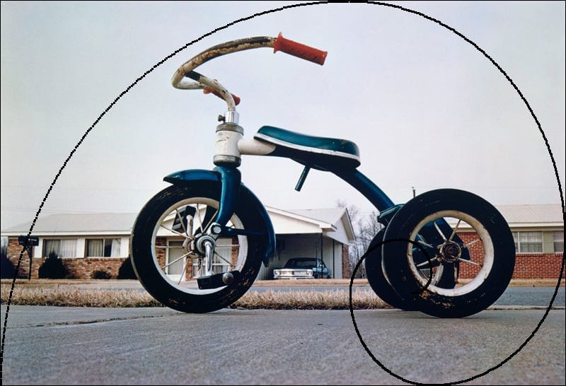
I started thinking about this when I put together a beginning to intermediate photo class I teach from time to time. Of course I have a section on the rules of composition, but me being me, I started looking for famous photos that didn’t follow any rules. One of my first thoughts was that William Eggleston’s famous, or infamous, tricycle photo stood out as the perfect example. Nope.

On a related note, this article about Eggelston’s photo, written by a Pulitzer Prize winning critic demonstrates my problem with discussing photography. I am congenitally unable to discuss what I consider very good or great photographs, believing that photography is a visual medium that can only be understood in a non-verbal manner by our right brain, and that our left brain just gets in the way with its verbal gibberish. Consider this passage from the linked article:
It’s at once beneath homeliness yet oddly exalted. One way Eggleston achieves this effect is obvious: he shoots the tricycle from a low angle. It looms large in the imagination because it looms large, period. Looking heavenward, Eggleston’s camera bestows on that tricycle the majesty—and ineffability—of an archangel’s throne.
The tricycle does not stand alone. You also find two ranch houses and a car in a carport. You have a patch of dead grass, some asphalt, the sweep of gray sky. The scene is all very, well, negligible. Or is it? The grass and asphalt almost eerily mirror the sky as neutral space. The trike is shot in such a way as to dominate the foreground, like a chariot of very youthful gods. Archangels, deities: for Eggleston, the profane is what’s sacred. Has anyone ever evoked the enchantment of the banal quite so well? “I am at war with the obvious,” he has said.
The tricycle’s many curves mock the angularity of the roofs to the rear. Then there’s the chromatic play of red handle grips with bluish-green seat and frame, not forgetting the several bits of white on seat, frame, stem and wheel rims—the whiteness playing off the roofs and trim of the houses. Color is absolutely not an afterthought… The whole thing is a model of unobtrusive artistry amid the everyday nondescript. It seems so simple and artless. Looked at closely, though, it’s as cunning as a seduction, as ordered as a sonnet.
An archangel’s throne? Really? All I see that can possibly be described in words is that it’s a perfect example of composing an image with the golden spiral and a classic example of color theory using complimentary colors.
Of course the content of a photo can make us feel a certain way. That photo, for example, could have been shot in my neighborhood when I was a kid, so it reminds me of my childhood. The prize winning critic is transported to heaven and sees a golden throne, or at least he claims to. Perhaps he’s just being writerly? Anyway, it’s the feeling evoked that matters, not any of that verbal stuff. I suspect that somehow the rules of composition and color theory speak to us on a deep, unconscious level and evoke feelings that poorly composed images just can’t .
WTF‽
Note that sentence ends with an interrobang. Before just now, I’d never heard of an interrobang. When I first saw it, my first thought was it might be some kind of a sex thing. Maybe cop slang for raping someone during interrogation, but that didn’t make sense in the context of “Mia Goth …is a human interrobang,” which I read somewhere and had to look it up. Even knowing that an interrobang is a combination of a question and an exclamation point, it still doesn’t quite make sense in that sentence, unless they are suggesting that her acting is severely limited, which I don’t think is the case.
New (to me) Music
Dickhead Blues by Kara Jackson is a depressing song about guys being like the title suggests. I like the singer’s voice and the instrumentation, but this song is interesting as a window into how being sexually objectified can harm a young woman’s self-esteem, something which most guys just don’t get, and I confess I didn’t for a long time. Hopefully that’s changing somewhat with the younger generations, but given the ubiquity of porn in their lives, I’m not so optimistic.
Moby’s Ambient Music
I listen to ambient music a lot these days. It’s good for working on my photo and writing projects early in the morning, and also for the drive to work and while I’m doing physical therapy for my arm. I was surprised to find Moby has quite a few ambient records and that now they are among my favorites. Check them out if you like ambient.
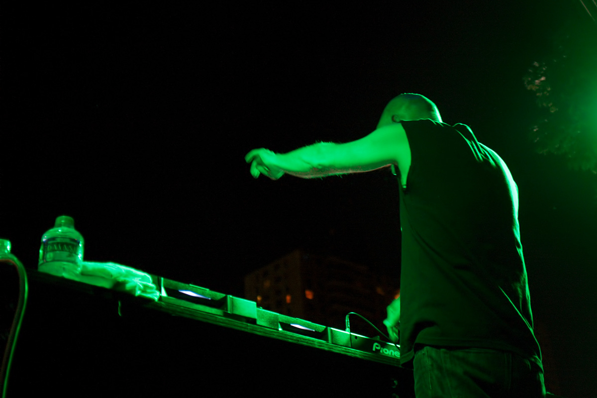
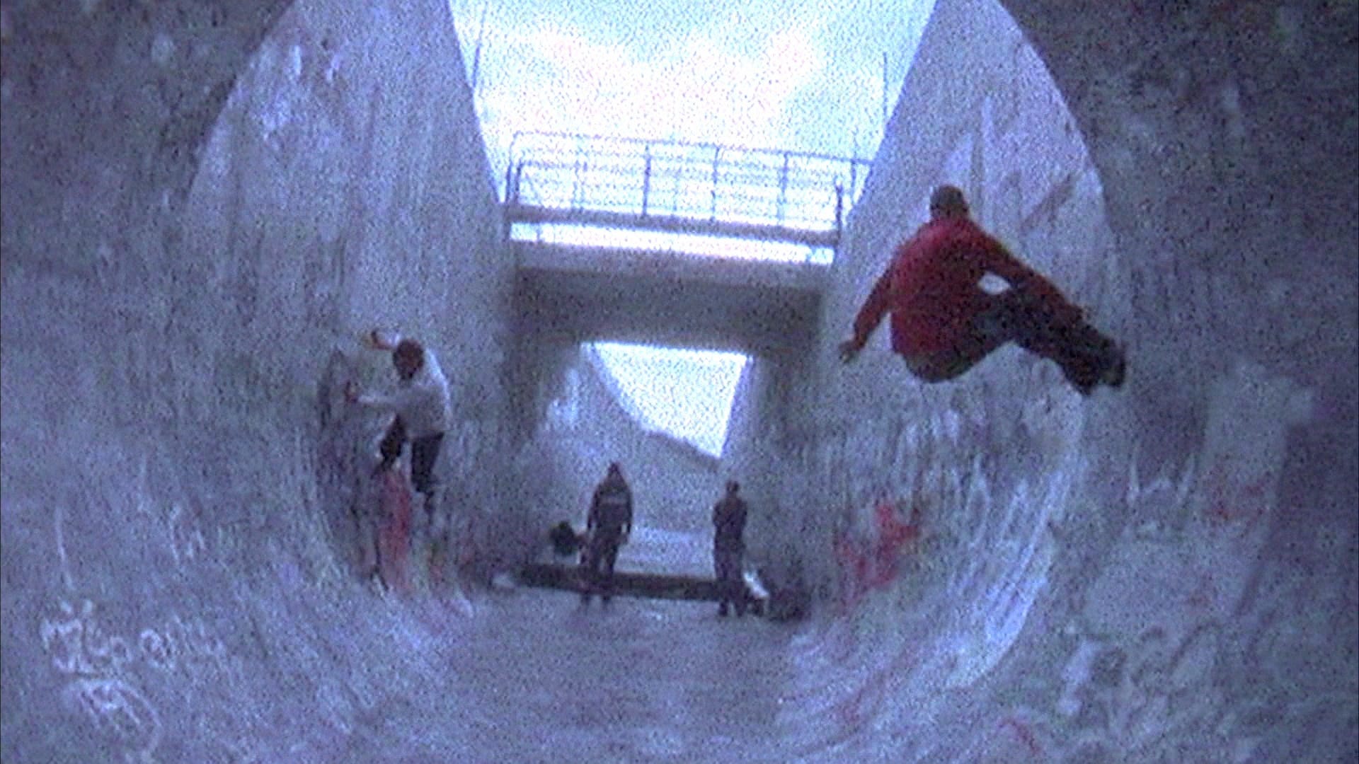
Here’s a short video from YouTube from the same performance from someone who is not me. Being that what he’s doing in this video is just about all I knew about Moby’s music, you can see why I was surprised he did ambient. As a bonus, you can see the estimable Coney Island USA photographer Norman Blake off to the left. If you want a quick compare/contrast of how different photographers work, compare my location from the photo above with where they are standing.
Recent Movies I’ve Seen
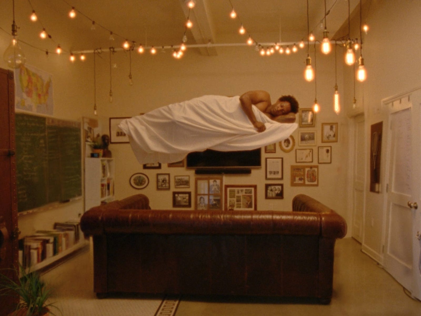
The Sleeping Negro, available on Mubi, is a short film that, I think it’s fair to say, is about black rage, though of course that’s not all it’s about. I watched it because of this still which I thought showed influences from Ralph Ellison and Tarkovsky. I was definitely right about Tarkovsky, as in addition to the floating motif, there is a scene straight out of Stalker. Plenty of James Baldwin as well. Not sure all of those literary and cinematic references add up to something coherent, but it gives you something interesting to think about.
I was also interested in order to get a better idea about how educated young black men may be feeling about the world these days, as my son is an educated young black man. On that level, the film left me a little disappointed and scared. The protagonist is angry, justifiably angry no doubt, at a lot of things and in some cases treats people badly. I was hoping the film would be about his growth from feeling his anger and resulting actions are justified into a wiser way of dealing with the world, but I don’t think that happened. Seemed the message was that, for an educated young black man, living in a state of anger is a good thing, or at least inevitable.
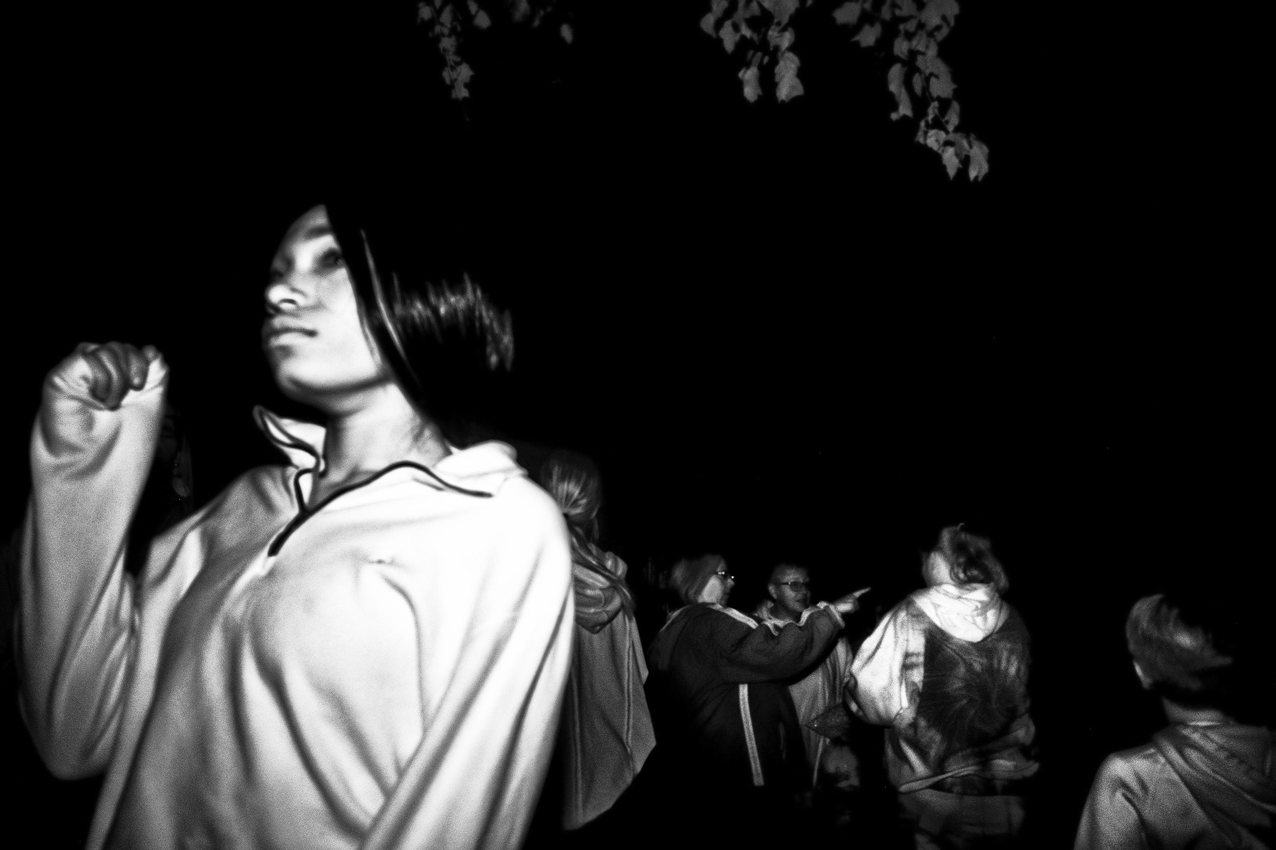
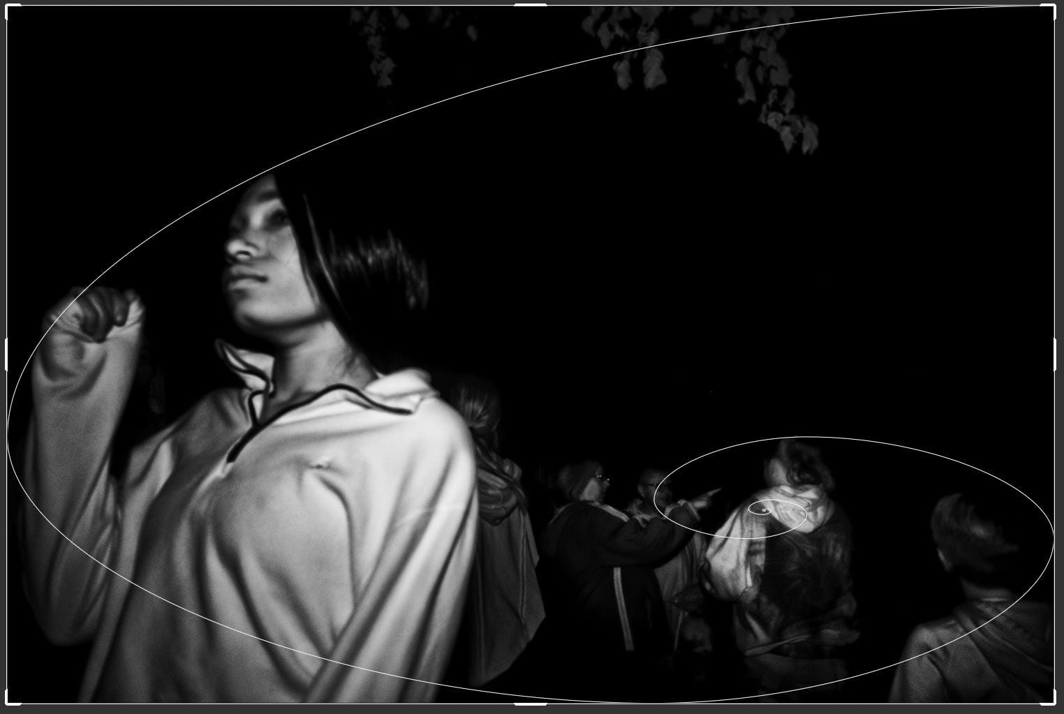
On another note, seeing the still above, I couldn’t help thinking of this photo:

Which brings me back full circle to my thoughts on rules of composition.
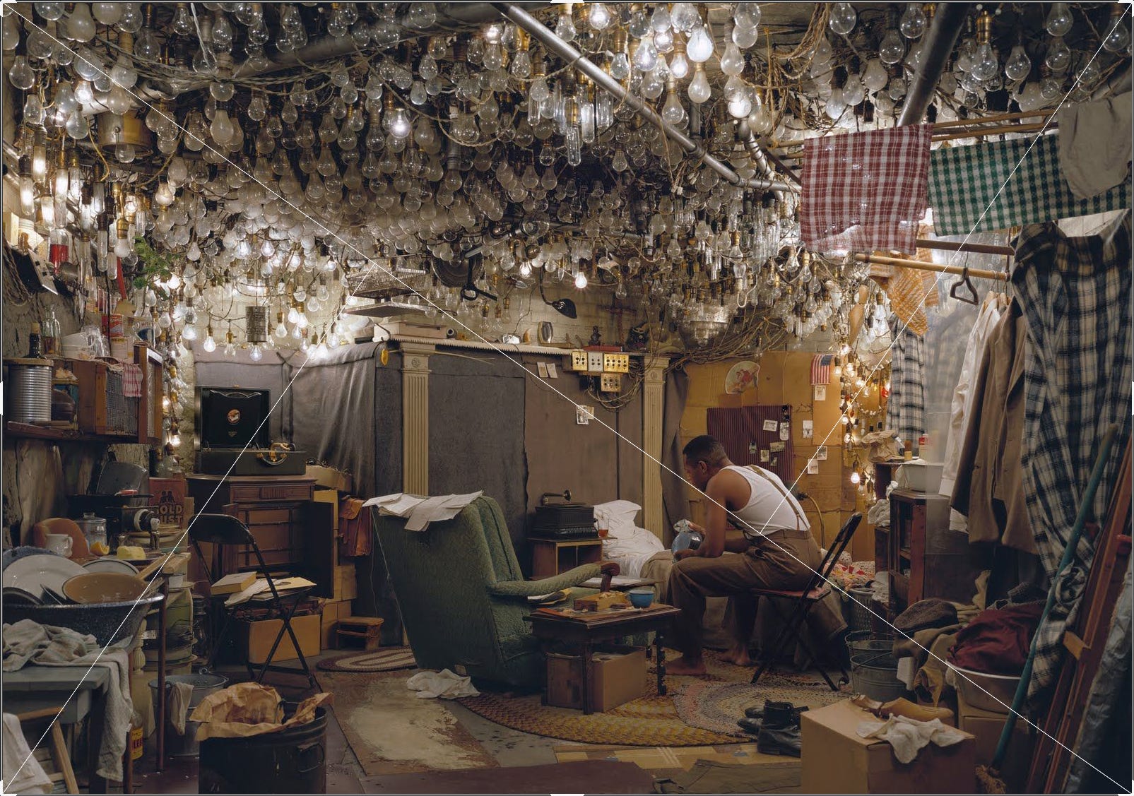
It’s really difficult to find a great photo that doesn’t fit with one rule or another, usually several.
Paranoid Park
Rewatched Gus Van Sant’s Paranoid Park and was really struck by the cinematography. Sequences like the clip above were shot on Super 8 film, and the bulk of the movie with 35mm film. The difference in quality between that and the great majority of films shot with digital these days is vast. I could go on, but will save that discussion for a future article.
Oscar Contenders
Triangle of Sadness, Tar, Banshees of Inisherin, Elvis and Avatar: The Way of the Water are among this year’s Oscar contenders. In short, I thought Elvis and Banshees of Inisherin were not good films. Triangle of Sadness is kind of a mess, but has some good laughs. I wanted to see Avatar just to see what the best film technology money could buy would look like and it looked great. It was like seeing a play in the first row with your feet propped up on the stage. I thought Tar was easily the best of them, though I had to get past the fact that it’s yet another film that humiliates a powerful woman, which isn’t easy. But if you can stomach that, it’s an incredibly well-done portrait of a great artist chock full of moral ambiguity. I like ambiguity with my art, and was not disappointed on that score.
Is Nick Cave Evil?
Normally I’d think not, but after an email I got this morning, I’m not so sure. It’s disappointing because after reading The Red Hand Files for so long, I’d come to think of him as perhaps the wisest living person on earth, certainly up there. Click on the link and subscribe. You’ll thank me later.
But this morning I got an email saying he’s made available the concert that launched his Push the Sky Away album. Sounds like a nice enough thing to do, no? Check this out:

Really Nick? Seriously?
Please subscribe to get an email whenever I publish, which I expect to be about once a week. It’s free and you can ignore any options to give me money. That’s Substack doing that, not me.